 listicle
Custom Baby Sweater Color Combinations: A Guide
Table of Contents
- Understanding Color Psychology for Baby Clothing
- Best Yarn Colors for Baby Sweaters
- Custom Baby Sweater Color Combinations That Work
- Personalized Baby Sweater Design Ideas
- Contrast and Visibility: Making Patterns Pop
- Sizing and Care for Long-Lasting Color
- Frequently Asked Questions
Last Updated: September 19, 2026
Understanding Color Psychology for Baby Clothing
When choosing custom baby sweater color combinations, understanding color psychology helps you create pieces that are both visually appealing and emotionally resonant. The colors you select influence mood, comfort perception, and how the sweater photographs in those precious first-year memories.
Soft, muted tones create calm and gentleness, while brighter colors bring energy and joy. Match the color palette to the occasion and the wearer's personality.
Lighter colors show stains more readily, while darker shades hide wear. Mid-tone combinations balance knitted motif or name visibility with practicality.
Best Yarn Colors for Baby Sweaters
The most successful baby sweater color combinations account for how yarn colors interact with skin tone, lighting, and knitted motifs and/or names. Your foundation color determines aesthetics, readability, and how the piece photographs.
Neutral Tones and Pastels
Soft cotton yarns in cream, ivory, light gray, and pale beige create a sophisticated, understated look that works across seasons and genders, pairing beautifully with nearly any contrast yarn color.
Pastels, baby pink, soft blue, pale yellow, and soft natural, offer personality while maintaining a gentle aesthetic. Warm-toned baby pink complements warm or olive skin and photographs beautifully in golden light. Cool-toned camel suits cooler undertones and neutral indoor lighting. Soft blue comes in warm (sky blue, lilac and cool variations; warm versions feel cozier in winter, while cool blues photograph crisply in daylight.
Pale blue with white embroidery creates excellent contrast, while baby pink with bubblegum or lilac lettering feels warm. Neutral and pastel foundations are timeless, photograph beautifully, and age gracefully.
Bold and Vibrant Options
Bold colors like kelly green, navy, burgundy, and rich jewel tones create striking custom baby sweater color combinations with excellent contrast for knit contrast yarn
True navy pairs well with white or cream embroidery, while forest navy works beautifully with gold or champagne. Warm kelly green suits warm skin tones with cream or white, while cool kelly green photographs vividly with white or silver.
True burgundy pairs elegantly with cream or ivory, while warmer camel works with white or gold. Rich jewel tones, create memorable pieces: hunter with white or gold reads luxurious, royal with cream feels serene, purple with white or natural creates a unique statement.
Bold colors hide wear better and photograph more vividly, ideal for milestone documentation, though they're less versatile for gift-giving.
Matching Color to Baby's Skin Tone
Babies with warm undertones glow in warm neutrals, pastels, and bold colors (cream, camel, warm green). Babies with cool undertones are complemented by cool neutrals, pastels, and bold colors (ivory, baby blue, true navy, cool green).
Custom Baby Sweater Color Combinations That Work
The magic happens when you combine colors intentionally. Strategic pairing creates visual harmony and ensures your personalized embroidery stands out.
Two-Color Contrast Strategies
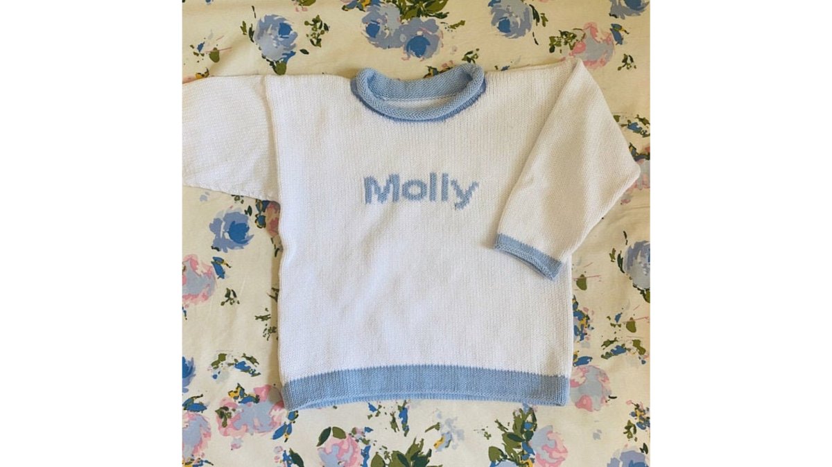
The simplest custom baby sweater color combinations use two colors: a base and a contrasting stripe or accent, such as Kelly Green with navy, bubblegum with white, or red with navy.
The base color provides stability while the stripe draws the eye, ensuring personalized names read clearly.
Effective two-color combinations include: Light + Dark (cream with navy, white with burgundy), Complementary Colors (yellow with purple), Monochromatic Variations (cream with ivory), and Warm + Cool (warm cream with cool navy).


Adding a Third Color for knit motif.
A third color, contrast yarn, elevates the design into a three-part composition.
The third color should match one base color or provide intentional contrast. White or cream embroidery on bold bases creates maximum readability, while matching colors create subtlety and contrasting colors add luxury.
The strongest three-color approach is two base colors (one dominant, one accent) plus one embroidery color that reinforces or contrasts.
Personalized Baby Sweater Design Ideas
Beyond color theory, successful designs match the color palette to the purpose and season.
Two Color Personalized Name Pullover →
Seasonal Color Palettes
Spring welcomes soft pastels and blush. Summer calls for brighter combinations like white with coral. Fall leans toward warm tones like cream with rust. Winter embraces deeper hues like navy with white.
Seasonal combinations feel emotionally aligned with the time of year, making them perfect for milestone photos, holiday gifts, or baby shower presents.
A custom baby sweater in spring pastels makes an ideal baby shower gift in March or April. A bold green and white combination feels fresh for summer but works year-round. The emotional resonance of seasonal colors adds another layer of meaning to a personalized keepsake.
Themed and Custom Designs
Military families often request custom military-themed designs using patriotic color combinations: navy with red and white, forest green with gold, or deep blue with white. The Personalized Name Sweater with Shamrocks demonstrates how thematic yarn, in this case, festive shamrocks, pairs with intentional color choices to create a sweater with cultural significance.
Holiday-themed combinations are equally powerful. Red and white for Christmas, orange and black for Halloween, or pastel combinations for Easter.
Contrast and Visibility: Making Patterns Pop
The difference between colors that blends and colors that commands attention comes down to contrast, specifically, the difference in lightness and darkness (luminance) between the base yarn and the motif yarn color. Understanding contrast mechanics ensures your personalized knitwear is visible in photos, in person, and through years of wear.
Understanding Luminance Contrast
Contrast is not about color difference alone; it's about how light or dark each color is. Two colors can be completely different hues but have similar lightness, resulting in poor contrast. Conversely, two colors from the same family can have very different lightness levels and create strong contrast.
Testing Contrast Before You Commit
When selecting a custom baby sweater color combination, consider how the yarn color will interact with the base. The strongest approach is to request color samples or examples before finalizing your order. Ask to see the specific yarn color you're considering knit on the exact yarn color you've chosen. Lighting matters: view the sample in natural daylight, indoor artificial light, and in a photograph taken with a smartphone camera. This reveals how the combination performs across real-world conditions.
If samples aren't available, use this decision framework:
- Maximum contrast (best for readability and photos): Light thread on dark base (white or cream on navy, forest green, burgundy, or charcoal) or dark thread on light base (navy or forest green on cream, ivory, or pale yellow). These combinations remain visible through multiple washes and years of wear.
- Strong contrast (excellent for most purposes): Medium-light thread on medium-dark base (pale gold on forest green, silver on navy, or cream on burgundy) or medium-dark thread on medium-light base (navy on pale blue, forest green on pale yellow). These work in most lighting and photograph well.
- Subtle contrast (sophisticated but requires proximity): Similar-lightness colors in different hues (cream on pale blue, ivory on pale pink, or pale gold on pale green). These feel elegant and understated but work best when the viewer is close enough to see the detail.
Why Contrast Matters Beyond Aesthetics
High-contrast yarn ensures the personalization remains visible through multiple washes and years of wear. Fading affects both the base yarn and the thread, but when contrast is strong, the color remains legible even as both colors soften slightly. Low-contrast yarn fades faster visually because the gap between base and thread narrows as both colors age.
Thread Color Options and Their Contrast Behavior
White and cream threads offer maximum contrast on dark bases and are the most versatile choice across yarn colors. Gold and champagne threads create warm, luxurious contrast on deep jewel tones (navy, forest green, burgundy) and work beautifully on warm neutrals (cream, warm beige). Silver threads offer cool, modern contrast on bold colors and cool neutrals. Navy and forest green threads create subtle, sophisticated contrast when embroidered on lighter bases and work well for monochromatic designs.
Sizing and Care for Long-Lasting Color
A beautiful custom baby sweater color combination means nothing if the colors fade or the piece shrinks after the first wash. Proper care preserves both the color saturation and the fit.
Aspect | Impact on Color & Quality |
|---|---|
Water Temperature | Cold water preserves color; hot water accelerates fading |
Drying Method | Flat drying or air drying maintains shape; direct heat fades colors |
Storage | Cool, dark places preserve color; sunlight causes fading |
Washing Frequency | Less frequent washing extends color life; gentle cycles reduce wear |
Sizing | Proper fit means more wear; oversized pieces often go unused |
Frequently Asked Questions
What are the best color combinations for custom baby sweaters?
The best combinations depend on your preference and the baby's skin tone. Neutral tones like white, cream, navy, and soft gray pair beautifully with pastels like bubblegum pink, pale yellow, or sage green. For higher contrast and visibility of embroidery, try navy with bright pink, kelly green with white, or red with navy. Two-color striped designs (rugby style) work especially well because the color contrast makes any personalized name or initial stand out clearly against the sweater.
How do I choose colors for a personalized baby gift?
Consider the recipient's nursery colors, the parents' aesthetic preferences, and seasonal timing. For baby showers, soft pastels feel celebratory and timeless. For holidays, consider festive options like navy with kelly green shamrocks for St. Patrick's Day themes. Ask the parents about color preferences if possible, or choose neutral combinations that work year-round. Hand-knitted sweaters become keepsakes, so pick colors that won't feel dated in photos years later.
Are neutral colors better for custom baby sweaters?
Neutral colors like white, cream, navy, and soft gray are versatile and work with many outfits, making them practical for everyday wear. However, they're not necessarily better than pastels or bolder combinations. Neutrals photograph beautifully and feel timeless for keepsakes. If you want the personalized embroidery to stand out, pair a neutral base with a contrasting name color. Many families choose neutrals for practicality but add personality through the embroidery thread color.
Can I customize the colors on hand-knitted sweaters like the Two Color Personalized Name Pullover?
Yes. The Two Color Personalized Name Pullover at $71.99 lets you choose your own color combination for the stripes and a separate color for the personalized name. You can mix and match from a wide color palette to create exactly what you envision. The sweater is knit in 100% cotton, Knit in the USA, and comes with free gift wrapping, making it perfect for creating a one-of-a-kind keepsake that reflects your personal style.